
While working on an application, I found some modals were duplicated because they could be shown in different parts of it. Also, there was an instance of the modal component for each modal, instead of reusing the same. I came up with a modal system that centralizes the management using Redux to solve these issues.
This tutorial explains how to build a simple, centralized modal component using React and Redux.
If you don't want to follow the tutorial, you can just check the GitHub repository below.
 andremonteiro95
Setting up the project
Let's create a new React project using Create React App. It creates a new React project with TypeScript support; if you don't want to develop in TypeScript, go ahead and remove the template flag.
npx create-react-app react-redux-modal --template typescriptI use TypeScript for all my projects because I find many advantages in it, such as finding errors in build time (which leads to higher code quality), and better usability in the development environment (type hinting, code completion, etc.). If you are not acquainted with TypeScript in React projects, the React + TypeScript Cheatsheets may be useful to you.
Creating the modal component
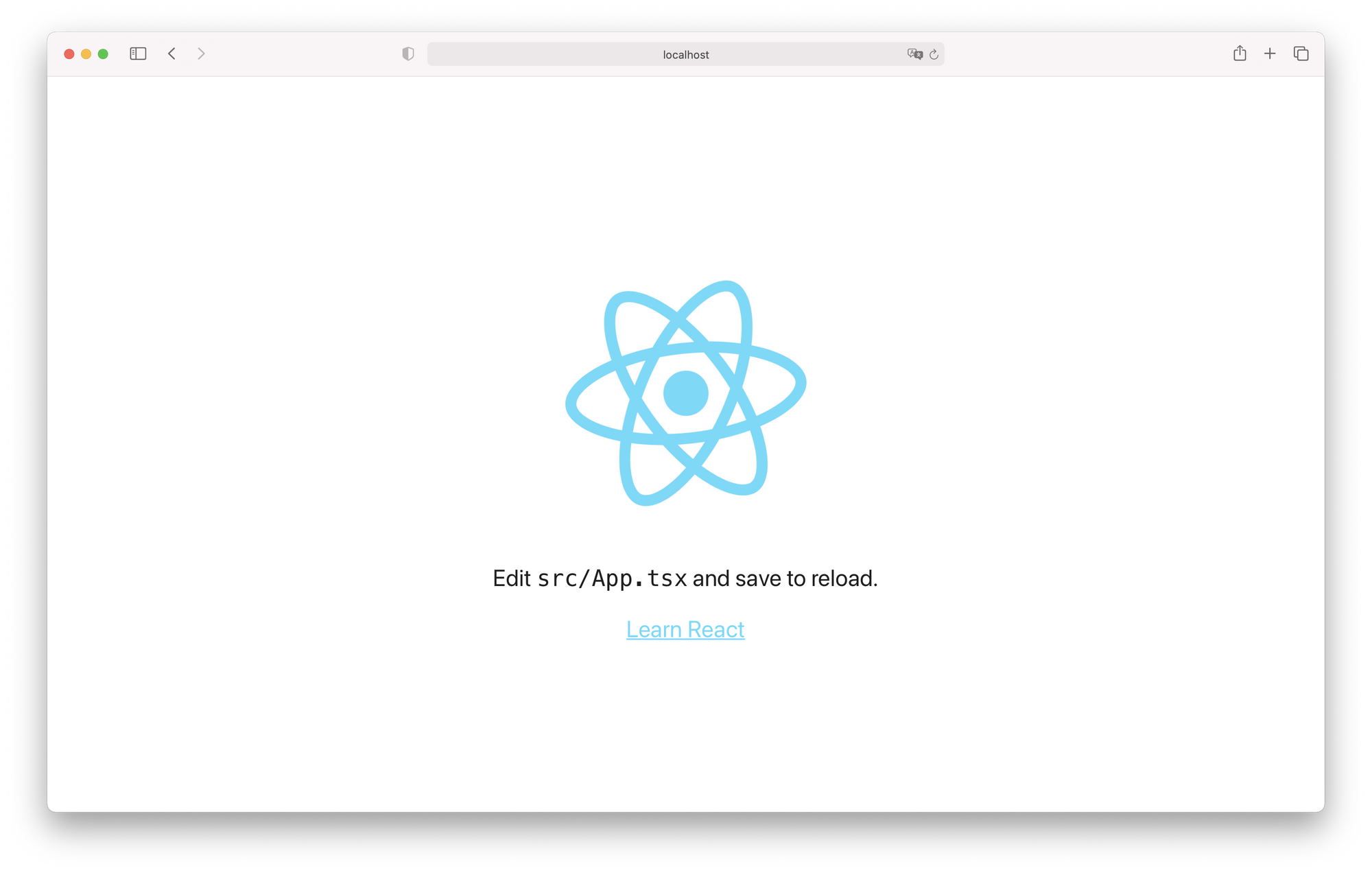
First, let's change the styling of the default content a little. I want my modal to add an overlay to the page so it's more apparent that an action is due, which will not work as good if I keep the default dark background. Open App.css and change the following properties of App-header class.
.App-header {
  background-color: #ffffff;
  // ...
  color: #202020;
}
Your app should look like the screenshot below.
Now it is time to build our modal component. Create a components directory, and a Modal.tsx file inside it. For now, we won't care about the modal itself, we will just declare a simple component with some placeholder text.
import React from 'react';

function Modal() {
  return <span>This is my new modal!</span>;
}

export default Modal;
Since the purpose is to create a centralized modal, add your modal to the root of your project - in this case, the App component in App.tsx.
import React from 'react';
import logo from './logo.svg';
import './App.css';
import Modal from './components/Modal';

function App() {
  return (
    <>
      <Modal />
      <div className="App">
        <header className="App-header">
          <img src={logo} className="App-logo" alt="logo" />
          <p>
            Edit <code>src/App.tsx</code> and save to reload.
          </p>
          <a
            className="App-link"
            href="https://reactjs.org"
            target="_blank"
            rel="noopener noreferrer"
          >
            Learn React
          </a>
        </header>
      </div>
    </>
  );
}

export default App;
In the top of your page should now appear the phrase "This is my new modal!". Create a div for the modal overlay, and another div inside for the modal itself. Then, create a new Modal.css stylesheet to include our new containers' styles.
import React from 'react';
import './Modal.css';

function Modal() {
  return (
    <div className="modal-overlay">
      <div className="modal">This is my new modal!</div>
    </div>
  );
}

export default Modal;
.modal-overlay {
position: absolute;
z-index: 9;
top: 0;
right: 0;
bottom: 0;
left: 0;
background-color: rgba(0, 0, 0, 0.7);
display: flex;
justify-content: center;
align-items: center;
}
.modal {
background-color: #ffffff;
border: 1px solid #bebebe;
border-radius: 2px;
padding: 12px 16px;
}
Feel free to choose your own approach for styling the components, I'm using stylesheet files just for demonstration purposes.
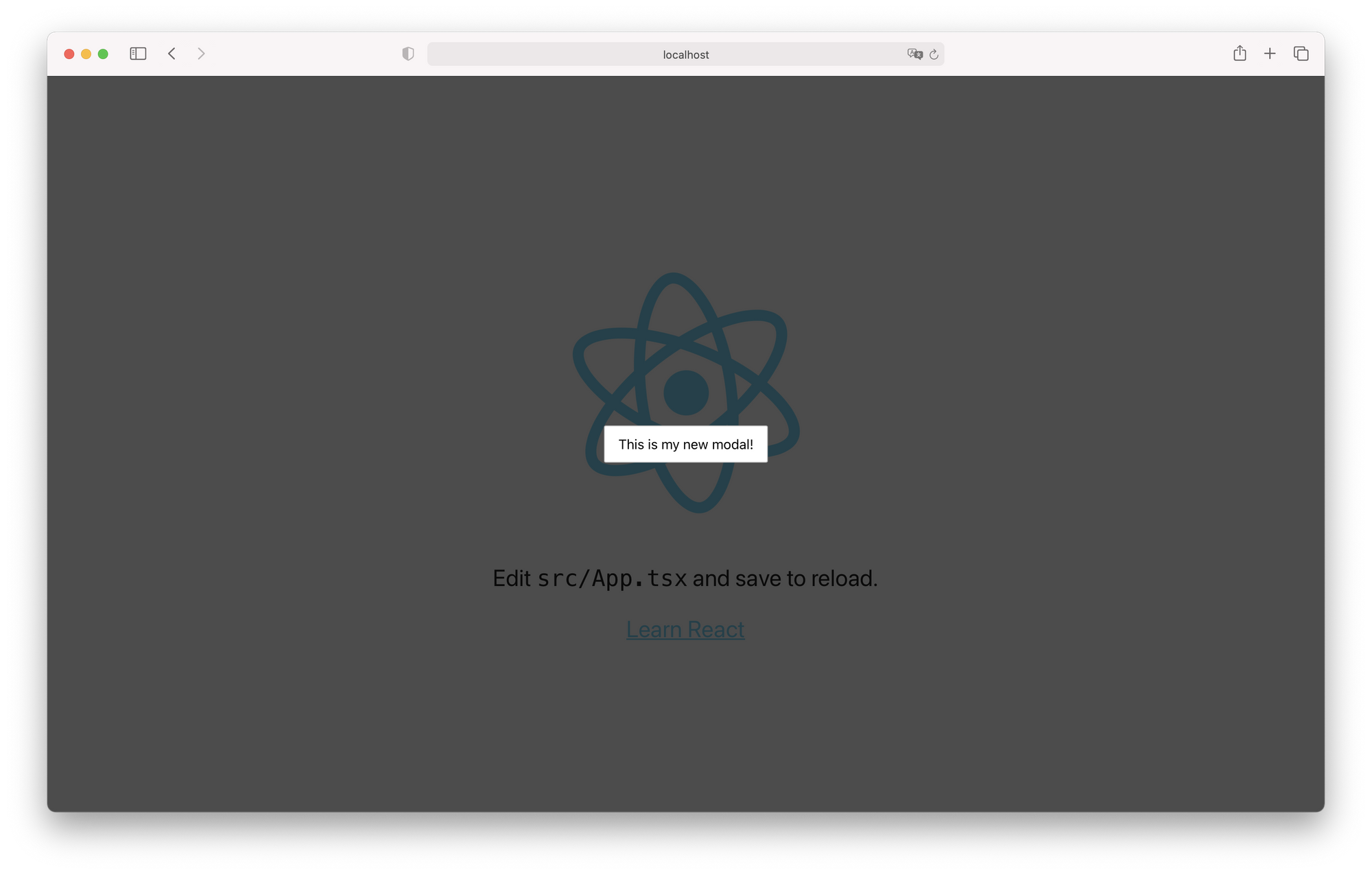
After these changes, our app should look like this:
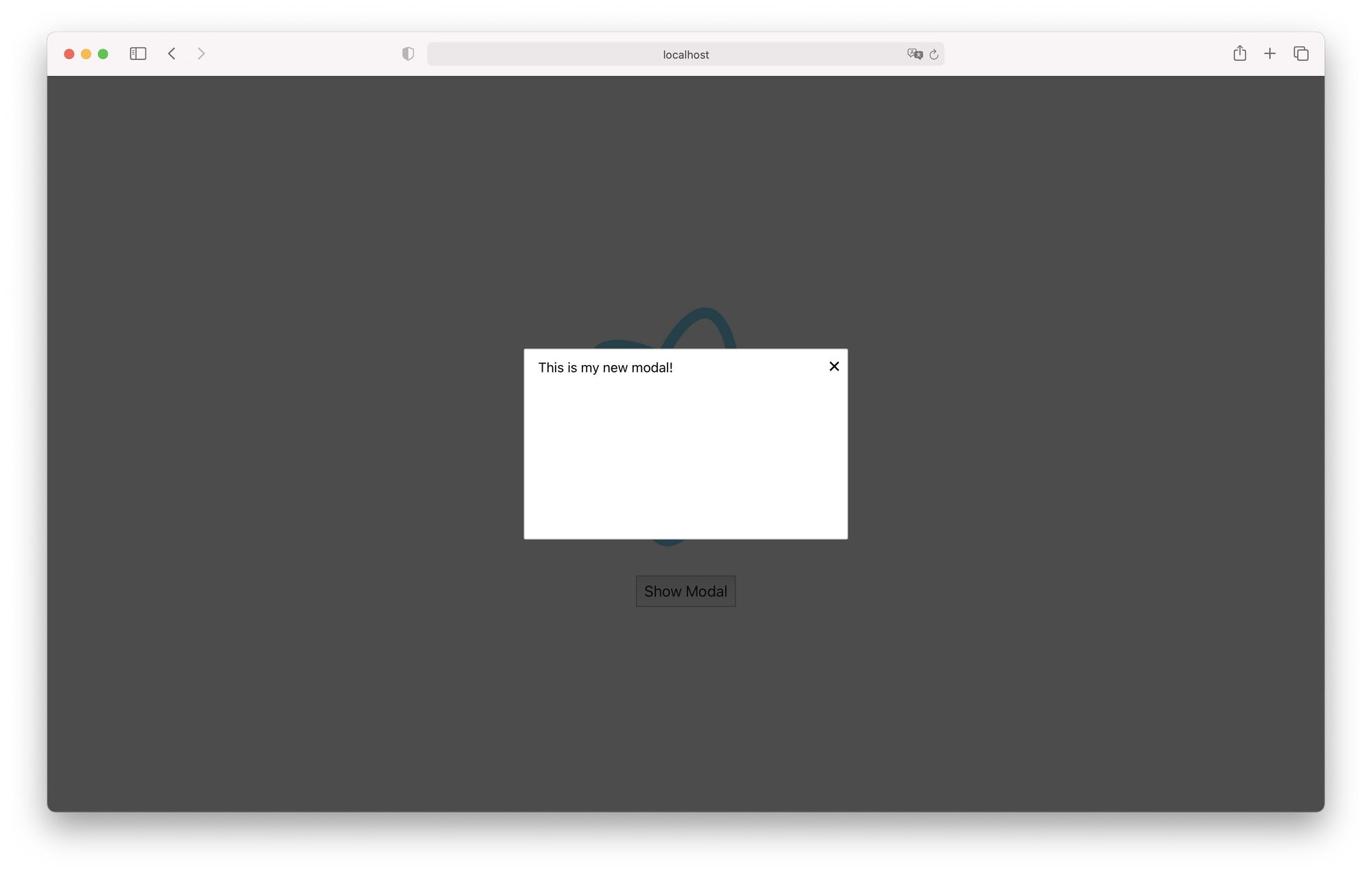
Right now, there is no way to close or open the modal, it simply opens as soon as we refresh the page. We will add a button to the modal for it to close when clicked.
import React from 'react';
import './Modal.css';
type ModalProps = {
onCloseButtonClick: () => void;
};
function Modal(props: ModalProps) {
const { onCloseButtonClick } = props;
return (
<div className="modal-overlay">
<div className="modal">
<span className="modal-close" onClick={onCloseButtonClick}>
✕ {/* HTML code for a multiplication sign */}
</span>
This is my new modal!
</div>
</div>
);
}
export default Modal;.modal-overlay {
position: absolute;
z-index: 9;
top: 0;
right: 0;
bottom: 0;
left: 0;
background-color: rgba(0, 0, 0, 0.7);
display: flex;
justify-content: center;
align-items: center;
}
.modal {
background-color: #ffffff;
border: 1px solid #bebebe;
border-radius: 2px;
padding: 12px 16px;
position: relative;
height: 200px;
width: 350px;
}
.modal-close {
position: absolute;
right: 8px;
top: 4px;
font-size: 24px;
cursor: pointer;
}Add a variable to the App component's state so we can show and hide the modal, and replace the default content with a button to show the modal. I also added some global button styles to index.css.
import React, { useState } from 'react';
import logo from './logo.svg';
import './App.css';
import Modal from './components/Modal';

function App() {
  const [showModal, setShowModal] = useState(false);

  return (
    <>
      {showModal && (
        <Modal
          onCloseButtonClick={() => {
            setShowModal(false);
          }}
        />
      )}
      <div className="App">
        <header className="App-header">
          <img src={logo} className="App-logo" alt="logo" />
          <button
            onClick={() => {
              setShowModal(true);
            }}
          >
            Show Modal
          </button>
        </header>
      </div>
    </>
  );
}

export default App;
button {
  font-size: 18px;
  padding: 8px;
}
Note that we are using React hooks for the component state. When we click the button in the App component, we set the state variable showModal to true. When clicking the modal's close button, an event is triggered and passed to App through the Modal's properties, and then a function is called which sets showModal to false. The conditional rendering of Modal makes sure that the modal is only shown when showModal is truthy.
Managing the modal through Redux
In the last section we implemented a way to show the dialog from the App component, but what we wish to achieve is a way to show the dialog from any component. It would be unmaintainable to pass a function to show the modal from App to every child component of it, so we need another method to do it.
Redux centralizes the application state and logic in a global store, thus allowing us to centralize the dialog state and logic. We can dispatch actions to update the store and have components react to its changes. The Redux official documentation recommends the installation of the Redux Toolkit. We'll install react-redux also for the components.
npm install @reduxjs/toolkit react-redux
npm i --save-dev @types/react-redux
We'll start by building some actions. Create a store/actions.ts file that will hold the actions and their respective action types.
export enum ModalActionTypes {
  ShowModal,
  HideModal,
}

export interface ModalAction {
  type: ModalActionTypes;
  payload?: any;
}

export function showModal(): ModalAction {
  return {
    type: ModalActionTypes.ShowModal,
  };
}

export function hideModal(): ModalAction {
  return {
    type: ModalActionTypes.HideModal,
  };
}
Redux's documentation shows a different way of type checking actions and action creators from mine. I would say this way leverages TypeScript capabilities, but feel free to choose whatever version you like more.
For now, these actions won't be sending any payload since all we want to do is show and hide the modal. Now, create a file for our reducer, reducers.ts, under the store directory.
import { combineReducers } from '@reduxjs/toolkit';
import { ModalAction, ModalActionTypes } from './actions';

const initialState = {
  modal: false,
};

function modalReducer(state = initialState, action: ModalAction) {
  switch (action.type) {
    case ModalActionTypes.ShowModal:
      return {
        ...state,
        modal: true,
      };
    case ModalActionTypes.HideModal:
      return {
        ...state,
        modal: false,
      };
    default:
      return state;
  }
}

const rootReducer = combineReducers({ modal: modalReducer });
export type RootState = ReturnType<typeof rootReducer>;
export default rootReducer;
A Redux app only has one reducer function, the root reducer, which will handle all dispatched actions. Although, we can split this reducer in many reducers and combine them using combineReducers to get a root reducer. This root reducer is then used on the store creation, which we will do in store/store.ts.
import { createStore } from '@reduxjs/toolkit';
import rootReducer from './reducers';

const store = createStore(rootReducer);
export default store;
At last, we link Redux to our app's UI. First, wrap the application in a Provider. I chose to do so in index.tsx.
import React from 'react';
import ReactDOM from 'react-dom';
import { Provider } from 'react-redux';
import './index.css';
import App from './App';
import store from './store/store';

ReactDOM.render(
  <React.StrictMode>
    <Provider store={store}>
      <App />
    </Provider>
  </React.StrictMode>,
  document.getElementById('root'),
);
Let's set the button in App.tsx to dispatch an action to show the modal.
import React from 'react';
import { connect, ConnectedProps } from 'react-redux';
import logo from './logo.svg';
import './App.css';
import Modal from './components/Modal';
import { showModal } from './store/actions';

const mapDispatchToProps = {
  dispatchShowModal: showModal,
};

const connector = connect(undefined, mapDispatchToProps);

type AppProps = {} & ConnectedProps<typeof connector>;

function App(props: AppProps) {
  const { dispatchShowModal } = props;

  return (
    <>
      <Modal />
      <div className="App">
        <header className="App-header">
          <img src={logo} className="App-logo" alt="logo" />
          <button
            onClick={() => {
              dispatchShowModal();
            }}
          >
            Show Modal
          </button>
        </header>
      </div>
    </>
  );
}

export default connector(App);
Don't worry if your app doesn't compile after removing onCloseButtonClick from the modal's properties, we will remove it from there soon enough.
Let's now link up the Modal component to our Redux store.
import React from 'react';
import { connect, ConnectedProps } from 'react-redux';
import { hideModal } from '../store/actions';
import { RootState } from '../store/reducers';
import './Modal.css';
const mapStateToProps = (state: RootState) => ({
modal: state.modal.modal,
});
const mapDispatchToProps = {
dispatchHideModal: hideModal,
};
const connector = connect(mapStateToProps, mapDispatchToProps);
type ModalProps = {} & ConnectedProps<typeof connector>;
function Modal(props: ModalProps) {
const { dispatchHideModal, modal } = props;
if (!modal) {
return null;
}
const onCloseButtonClick = () => {
dispatchHideModal();
};
return (
<div className="modal-overlay">
<div className="modal">
<span className="modal-close" onClick={onCloseButtonClick}>
✕ {/* HTML code for a multiplication sign */}
</span>
This is my new modal!
</div>
</div>
);
}
export default connector(Modal);Now, your app should work just as fine as before, without relying on App's state! To recap, we now use dispatchShowModal to show the modal and dispatchHideModal to hide it, and those functions can be used wherever in the app as long as the component is connected to Redux.
Creating dynamic modals
Our modal only has a single sentence, but we want it to have more information. More than that, we wish that we could specify the information dynamically.
Right now, the modal state in Redux is a simple boolean that specifies if it is shown or not. We will change it so it accepts an object instead - this object will contain our modal's information, such as title and description.
Let's start by defining an interface for the modal's properties in interfaces/modal-properties.ts. For now, a title and a description are enough - later we will add buttons to it.
interface ModalProperties {
  title: string;
  description: string;
}
export default ModalProperties;
Since the modal state will now be an object of type ModalProperties, we must change the state of our store to reflect it. Set the modal property to null - the intended logic is to show a modal if the state is not null - and define a type for the state in reducers.ts. We also change the reducer to set the modal to null when a hide modal action is dispatched, and set the modal to one with placeholder title and description when a show modal action is dispatched.
import { combineReducers } from '@reduxjs/toolkit';
import ModalProperties from '../interfaces/modal-properties';
import { ModalAction, ModalActionTypes } from './actions';
type ModalState = {
modal: ModalProperties | null | undefined;
};
const initialState: ModalState = {
modal: null,
};
function modalReducer(state = initialState, action: ModalAction): ModalState {
switch (action.type) {
case ModalActionTypes.ShowModal:
return {
...state,
modal: {
title: 'Hello world!',
description: 'This is a description.',
},
};
case ModalActionTypes.HideModal:
return {
...state,
modal: null,
};
default:
return state;
}
}
const rootReducer = combineReducers({ modal: modalReducer });
export type RootState = ReturnType<typeof rootReducer>;
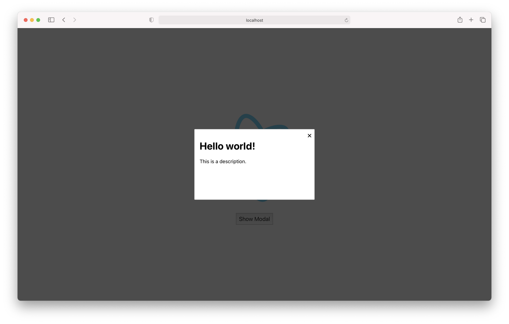
export default rootReducer;Change your Modal component to display the title and description.
function Modal(props: ModalProps) {
const { dispatchHideModal, modal } = props;
if (!modal) {
return null;
}
const onCloseButtonClick = () => {
dispatchHideModal();
};
return (
<div className="modal-overlay">
<div className="modal">
<span className="modal-close" onClick={onCloseButtonClick}>
✕ {/* HTML code for a multiplication sign */}
</span>
<h1>{modal.title}</h1>
<p>{modal.description}</p>
</div>
</div>
);
}Your app should now display the modal's title and description from Redux when you click in the "Show Modal" button.
The modal isn't totally dynamic yet: we still need to somehow pass the title and description to the store. So, we go to our actions.ts and change the showModal action creator. We can also change the payload type in ModalAction to the previously created interface.
export interface ModalAction {
  type: ModalActionTypes;
  payload?: ModalProperties;
}

export function showModal(payload: ModalProperties): ModalAction {
  return {
    type: ModalActionTypes.ShowModal,
    payload,
  };
}
Go back to your reducer and change the static properties for the action payload.
function modalReducer(state = initialState, action: ModalAction): ModalState {
  switch (action.type) {
    case ModalActionTypes.ShowModal:
      return {
        ...state,
        modal: action.payload,
      };
    case ModalActionTypes.HideModal:
      return {
        ...state,
        modal: null,
      };
    default:
      return state;
  }
}
Pass now some properties to dispatchShowDialog in your App.tsx.
function App(props: AppProps) {
  const { dispatchShowModal } = props;

  return (
    <>
      <Modal />
      <div className="App">
        <header className="App-header">
          <img src={logo} className="App-logo" alt="logo" />
          <button
            onClick={() => {
              dispatchShowModal({
                title: 'A new title.',
                description: 'And a new description too.',
              });
            }}
          >
            Show Modal
          </button>
        </header>
      </div>
    </>
  );
}
Adding functionality to the modal
Usually, modals or dialogs have buttons to achieve some effect, for instance to confirm some action. We will add a button to our modal which will open an alert in the browser, just for illustration purposes.
First, let's check what type of event is fired when the button is clicked. IntelliSense tells me it's of type React.MouseEvent<HTMLButtonElement, MouseEvent>. Let's add a new property to our ModalProperties that will specify the behavior of the button when clicked, with an event of the correct type as a parameter. We will keep it generic, although if you find that you need some specific property you can specify HTMLButtonElement in the type.
import React from 'react';
interface ModalProperties {
  title: string;
  description: string;
  onButtonClick: (event: React.MouseEvent) => void;
}
Now, add a button to the modal and link up this new property to the button's onClick event.
function Modal(props: ModalProps) {
const { dispatchHideModal, modal } = props;
if (!modal) {
return null;
}
const onCloseButtonClick = () => {
dispatchHideModal();
};
return (
<div className="modal-overlay">
<div className="modal">
<span className="modal-close" onClick={onCloseButtonClick}>
✕ {/* HTML code for a multiplication sign */}
</span>
<h1>{modal.title}</h1>
<p>{modal.description}</p>
<button type="button" onClick={modal.onButtonClick}>
Do something
</button>
</div>
</div>
);
}All that's left to do is set the behavior of that button in the modal properties when we dispatch the action to show the modal in the App component!
function App(props: AppProps) {
const { dispatchShowModal } = props;
return (
<>
<Modal />
<div className="App">
<header className="App-header">
<img src={logo} className="App-logo" alt="logo" />
<button
onClick={() => {
dispatchShowModal({
title: 'A new title.',
description: 'And a new description too.',
onButtonClick: (event: React.MouseEvent) => {
alert('You clicked that button!');
},
});
}}
>
Show Modal
</button>
</header>
</div>
</>
);
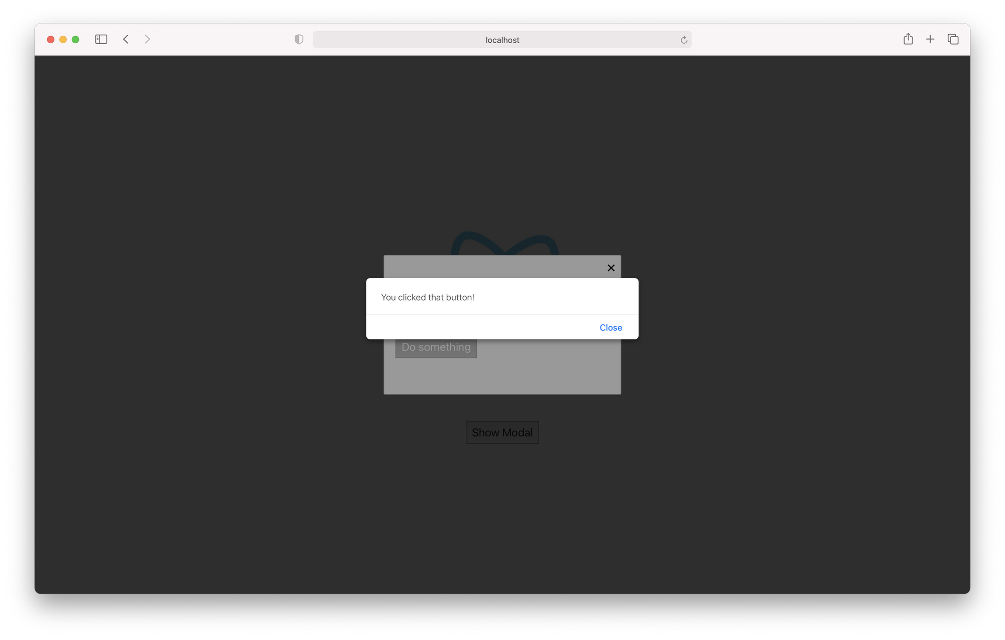
}Click that button now! You should see an alert window with the sentence "You clicked that button!".
Final thoughts
I've used polished, thoroughly tested versions of this approach in applications that are in production. For instance, to improve code reusability and maintainability I created a "library" of sorts that holds all modal definitions (like a list of items of type ModalProperties) so that when I want to change a modal that is reused in several places I only need to edit a single item.
Another way you can improve on this mechanic is to implement a stack of modals so that you don't lose a modal that is being shown in case another pops up.
The usage of TypeScript shown in this tutorial may be biased, and there may be better ways to type check Redux, so take it with a grain of salt.